Using text on images or colored backgrounds can make a great statement about your business, team, or that special announcement. Learning how to get these two elements to work together can be a bit challenging at times, but with a little practice and planning, your work can be one of those pieces that people will remember.
Let’s get started.
Text Trials and Tribulations
Using text (more commonly called fonts or typography) on a background other than white can cause a fair amount of stress, yet we see examples of this in any newspaper, flyer or brochure, or social media/internet/television ad. People like me that do this for a living are called graphic designers or graphic artists and probably got their degree in this field. I did.
Learning to combine these two elements is part of strategic communication. You don’t necessarily want your work to look pretty, but you will want it to communicate in a pretty awesome way.
There are two main types of fonts, and both have many members in their category. One type is serif. The word serif refers to the small line added to a printed letter in certain typefaces. These are like the letters you see in a book (one with binding that you can hold in your hand), and typically have thicker and thinner spots in each letter, such as the capital letter A or lowercase e. My former typeface teacher used to refer to these letters as “having feet” despite the fact the serif can sometimes be found on top of the letter, such as the capital letter S or lowercase letter b.
Examples of fonts that fall into this category include, but are not limited to:
- Times New Roman
- Century Schoolbook
- Bodoni
- Broadway
- Palatino
- Unicorn
- most cursive fonts.
The second type is called sans-serif. The word “sans” is an old Latin word that literally means, “without”. Sans-serif fonts don’t have that small line and are usually equal in thickness on all sides.
Examples of fonts that fall into this category include, but are not limited to:
- Arial
- Myriad Pro
- Avante Garde
- Century Gothic
- Lato
- Gotham
- Interstate
The Trial
There are thousands of fonts to choose from! Some have a lot of variations within their family, while some only have four or less. I prefer having more variations — I like having choices.
Most fonts have more than one style in their family, such as italic or oblique, bold or normal. Some of the sans-serif fonts may have several styles of “bold”.
You can pay up to several hundred dollars for a single font family. I prefer finding free fonts for downloading. Before you search, make sure your antivirus and malware softwares are running in the background; sometimes places not well known can transmit a virus through the download to your computer. Trust, but verify.
Here are a few of the websites I like to download fonts from and are safe:
- FontSquirrel.com
- 1001FreeFonts.com
- UrbanFonts.com
- All-Free-Download.com
The Tribulation
Color is not always your font’s friend. It’s also not your font’s fault, either. The combination of color and type again isn’t just to look pretty but to be readable. What good is that pretty font if you can’t read the words or numbers?
For example: about 10 years ago or so, I was out at a printshop with a friend of mine who, at the time, was a REALTOR®. He was picking up signage and wanted me to meet his printshop. When we arrived, his rep was talking with another REALTOR®, a young woman, about the business cards she was picking up. She was so excited to finally get them, she turned around and showed them to us. I admit, I was pretty harsh in my response because the printshop should have designed her card better. I told her I couldn’t read her text because she was using a very thin cursive font with curled tips in the numbers. Further, this very thin font was put over a very colorful photo. She paid for them anyway and rushed out the door to her next appointment.
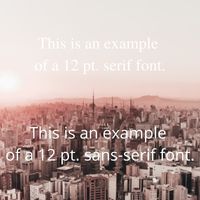
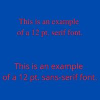
Colored backgrounds tend to swallow up lines in a font and, depending on the font, makes the letters very difficult to read. Using Canva.com as my visual creator, see the image below as an example.
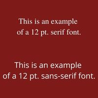
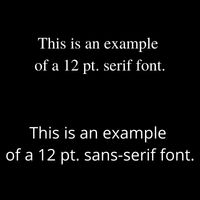
The text block on top has a white serif font against the burgundy background. The text block on the bottom has a white sans-serif font against the same background. Both text blocks are set to 12 pt. and unbolded. The next image shows the background as black; not much better but not much worse, either.
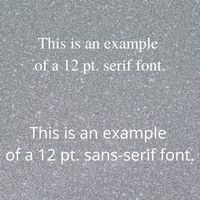
The third image shows an example of what my mentee did this week. She was creating a flier for her beading class and used a background that looked like gravel, and put text over it. Hard to read, right? I said the same thing.
The fourth image shows text over a photo of a city. Before you laugh, how many of you have seen something similar to this in a commercial? It happens all too often, trust me.
Darker backgrounds work better with light (weight, thickness) white text. Lighter backgrounds work better with dark (weight, thickness) colored text. Be careful of the colors! Don’t mix red and blue together without something separating the two colors. Don’t believe me? See for yourself in the next two images.
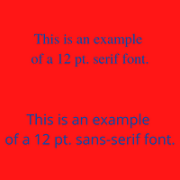
Going cross-eyed yet? Have a headache? So will your audience; be careful.
Tips For Success
Remembering these tips will help your work look more professional and make you look like a rockstar:
- Keep the number of fonts used in your work to no more than three (3).
- If your work is for social media or a website, sans-serif fonts work best, especially for mobile devices.
- Be consistent. Use one font family for headings and titles (i.e., Arial), and a different font family (i.e., Times New Roman) for body copy.
- Don’t put thin, light-colored fonts on top of light photos or backgrounds. Keep contrast in mind.
- Avoid using competing primary colors together (i.e., red and blue). This can cause visual distortion and a headache for your readers.
- If your work has a colored background or photo, use a heavier bold font so your text is more readable.
- According to this article, 10.5M people in the United States are colorblind. When you choose colors, keep your audience in mind.
If you have design tips you’d like to share, send me a note and I’ll update my article. Until next time….design happens!
Be strategic. Be visible. Be found.
Ready to start using social media smarter, not harder? Schedule a 15-minute one-on-one coffee chat over ZOOM to talk about ideas for combining both social media and inbound strategies into your current marketing plan.
Branded ZOOM backgrounds allow businesses to not only add another option for secondary marketing, but also confirm both identity and authority to prospects and customers. Investment starts at $60. Visit our webpage to get started.
#smallbusiness #businesstips #marketingtips #socialmedia #digitalmarketing #visiblymedia #thursdaytraining